

In a world where attention spans are fleeting and choices are abundant, businesses are constantly seeking innovative ways to captivate consumers. One often underestimated tool in their arsenal? Color. Yes, you read that right – the hues that adorn logos and packaging play a pivotal role in shaping consumer behavior and brand perception. Intrigued? Let’s delve into the colorful world of branding psychology.
The science of color perception
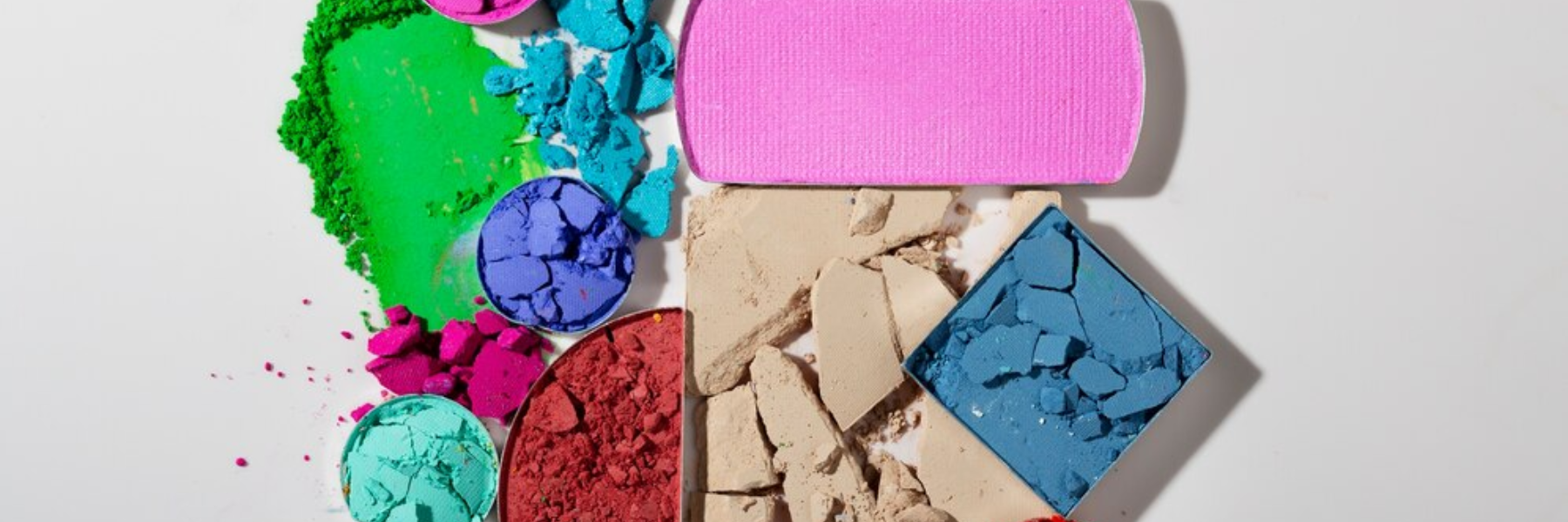
Before we unravel the impact of colors on the consumer psyche, let’s understand the basics. Colors aren’t merely visual stimuli; they evoke emotions, trigger memories, and subconsciously influence our decisions. Psychologists and marketers alike have long studied the phenomenon, revealing intriguing findings.
Red alert: The power of passion
Ever wondered why Coca-Cola chose red for its logo? It’s no coincidence. Red, with its association with energy and passion, stimulates appetite and grabs attention – perfect for a brand in the food and beverage industry. Research suggests that it can even increase heart rates and create a sense of urgency, making it a go-to choice for brands aiming to evoke excitement and action.
Think green: The color of harmony
On the opposite end of the spectrum lies green, a color synonymous with nature, tranquility, and growth. It’s no surprise that environmentally-conscious brands often incorporate green into their branding. Not only does it signify sustainability, but it also promotes feelings of balance and trust. From Whole Foods to Starbucks, green signifies more than just a color – it’s a commitment to ethical practices and holistic well-being.
Breaking the mold: Unconventional color choices
While certain industries have traditional color associations (think blue for finance and healthcare), some brands dare to defy norms with unconventional choices. Take Tiffany & Co., for instance – its iconic blue hue, aptly named “Tiffany Blue,” exudes sophistication and exclusivity. By owning this distinct color, Tiffany has established itself as a timeless symbol of luxury and elegance.
The color of trust: Building brand loyalty
In the fast-paced world of marketing, building trust is paramount. Interestingly, color plays a significant role in this endeavor. Studies suggest that consumers are more likely to trust brands whose colors align with their expectations. For example, a tech company opting for blue – a color associated with reliability and competence – instills a sense of trust in its audience. Consistency in color usage across branding materials reinforces this trust over time, fostering brand loyalty.
Painting a picture of success
As businesses navigate the competitive landscape of consumerism, understanding the psychology of color in branding can be a game-changer. By strategically harnessing the emotional and subconscious power of colors, brands can forge deeper connections with their audience, influence purchasing decisions, and carve out a distinct identity in the market.
In the vibrant canvas of branding, colors aren’t just adornments – they’re storytellers, evoking emotions, and shaping perceptions. So, the next time you encounter a brand, take a moment to ponder its color palette – you might just uncover a world of psychological intrigue behind those hues. After all, in the realm of consumer behavior, it’s not just black and white – it’s a kaleidoscope of colors, waiting to be explored.


